


[002]
PORTUGAL
TECH WEEK
ROLE
UX/UI DESIGNER
YEAR
2024
SPRINT
2 WEEKS
DELIVERABLES
WEBSITE REDESIGN
INTERACTIVE PROTOTYPE
DESIGN SYSTEM
STYLE GUIDE
VISUAL IDENTITY & CAMPAIGN
PROCESS
[1]
RESEARCH & DISCOVERY
[2]
HEURISTIC EVALUATION
[3]
USER RESEARCH
[4]
DEFINITION & MAPPING
[5]
INFORMATION ARCHITECTURE
[6]
USER FLOWS
[7]
ideation
[8]
MID-FIDELITY WIREFRAMES
[9]
prototyping
[10]
VISUAL DESIGN
[11]
DESIGN SYSTEM
[12]
DESIRABILITY TESTING
[13]
QA & ITERATION
IMPACT
33% VIEWS (84K IN 2024 → 112K IN 2025 )
65.2% UNIQUE VISITORS (23K IN 2024 → 38K IN 2025 )
200% VIEWS (2K IN 2024 → 6K IN 2025 )
OVERVIEW
Portugal Tech Week (PTW) is a nationwide tech event bringing together tech professionals, startups, and investors across multiple cities in Portugal.
The goal of this project was to redesign the PTW website to improve usability, clarify the event structure, and create a seamless experience from discovery to ticket booking.
The main challenge is that the platform hosted both official PTW initiatives and external “community events” in the same space, creating confusion and making navigation difficult.






PROBLEM
[001]
[FRICTION IN BOOKING EXPERIENCE]
[1]
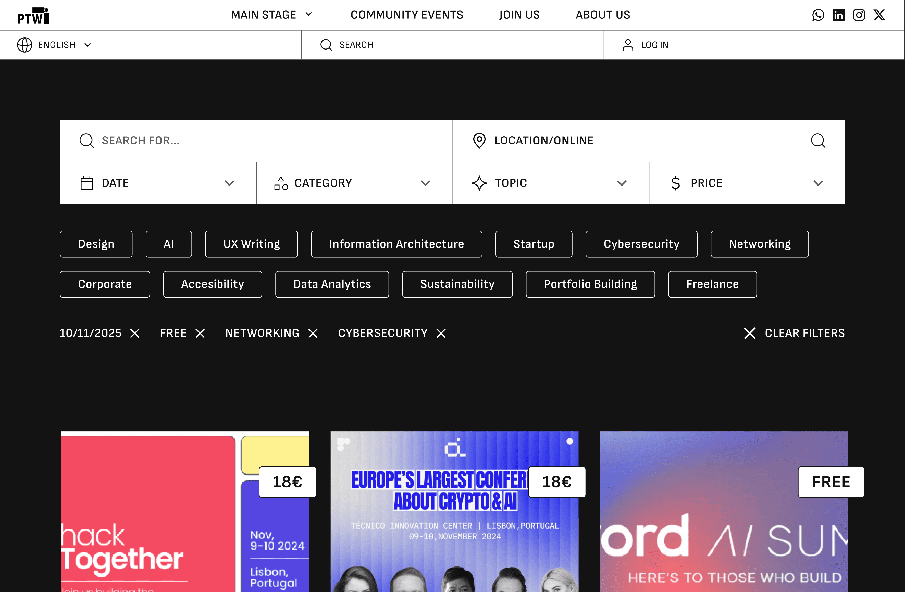
Event search was inefficient.
[2]
Users were redirected to external platforms to buy tickets.
[3]
The journey felt fragmented and unreliable.
[002]
[CONFUSING NAVIGATION & STRUCTURE]
[1]
Users struggled to understand the difference between official events vs community events.
[2]
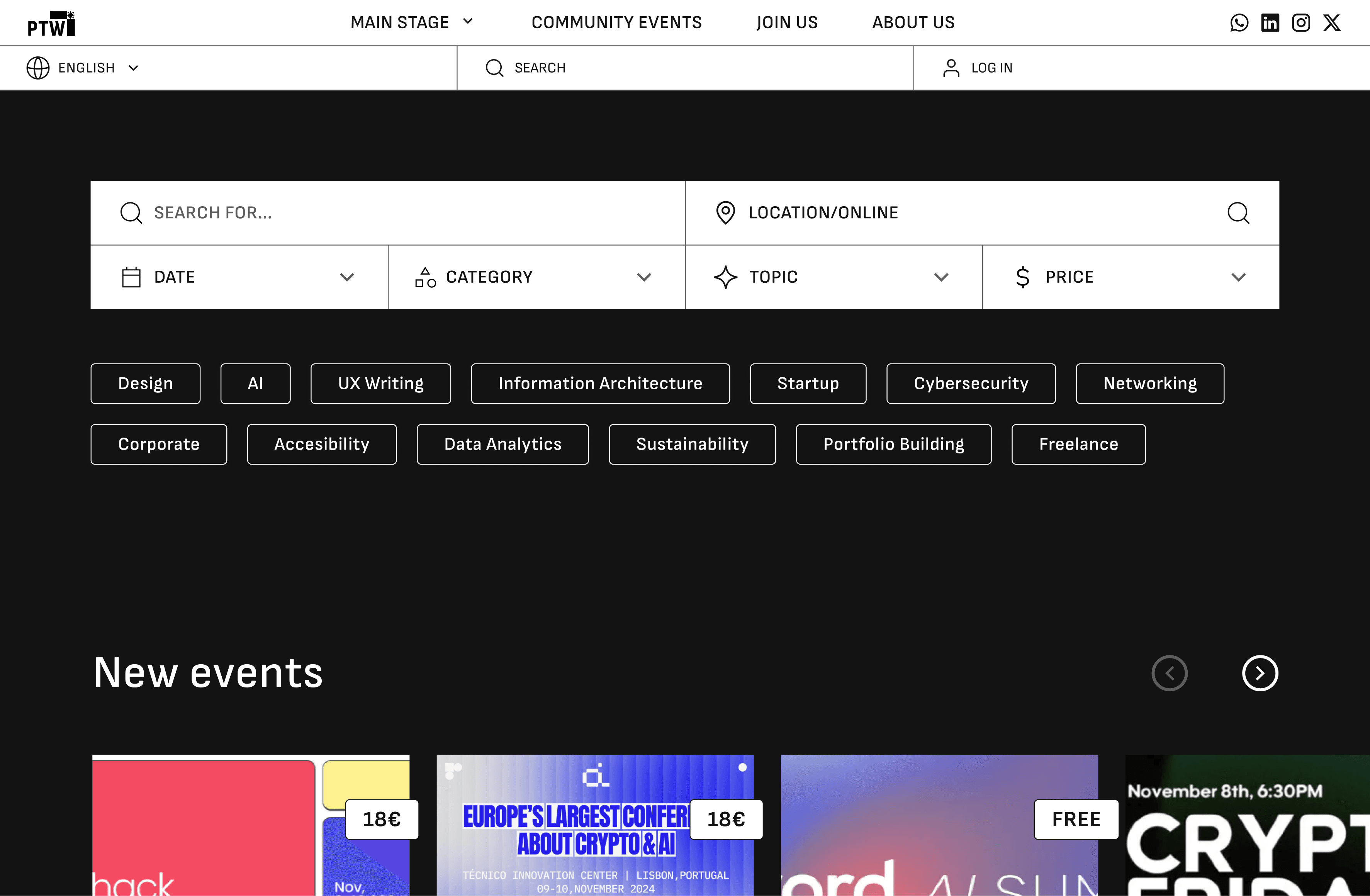
Pages were long, cluttered, and required excessive scrolling.
[3]
Key information was hard to find.


[003]
[WEEK BRANDING]
[1]
Inconsistent visual identity.
[2]
Overuse of AI-generated visuals reduced credibility.
[3]
The design didn’t reflect the scale of the event.
[004]
[CRITICAL MOBILE ISSUES]
[1]
Mobile experience described as “unusable”.
[2]
Engagement was significantly lower on mobile (49s) compared to desktop (1m 44s).
[3]
The design didn’t reflect the scale of the event.
user research
[PRIMARY AUDIENCE]
[1]
TECH PROFESSIONALS
[2]
Entrepreneurs
[3]
Investors / sponsors
[THESE USERS ARE]
[1]
Digitally savvy
[2]
Time-sensitive
[3]
Expecting fast, clear, and efficient experiences
GOALS
[001]
[OPTIMISE THE END-TO-END USER JOURNEY]
Reduce friction across the full experience, from event discovery to registration, to enable faster decision-making and increase conversion rates.
[002]
[INFORMATION ARCHITECTURE]
Structure content in a way that clearly differentiates official and community events, improving findability while supporting the platform’s multi-event ecosystem.
[003]
[ELEVATE BRAND PERCEPTION]
Develop a strong and culturally grounded Portuguese visual identity that reflects the scale and ambition of the event.
[004]
[STREAMLINE THE BOOKING PROCESS]
Develop a strong and culturally grounded Portuguese visual identity that reflects the scale and ambition of the event.
[005]
[ENHACE MOBILE EXPERIENCE]
Optimize responsiveness to reduce frustration, lower drop-off rates, and improve overall usability on mobile devices.
VISUAL IDENTITY
Header 1
Header 2
Header 3
Title 1
Title 2
Title 3
Body 1
Body 2
Body 3

#131313
#5E5E5E
#ACACAC
#FFFFFF
#F9E11B
#283CC8




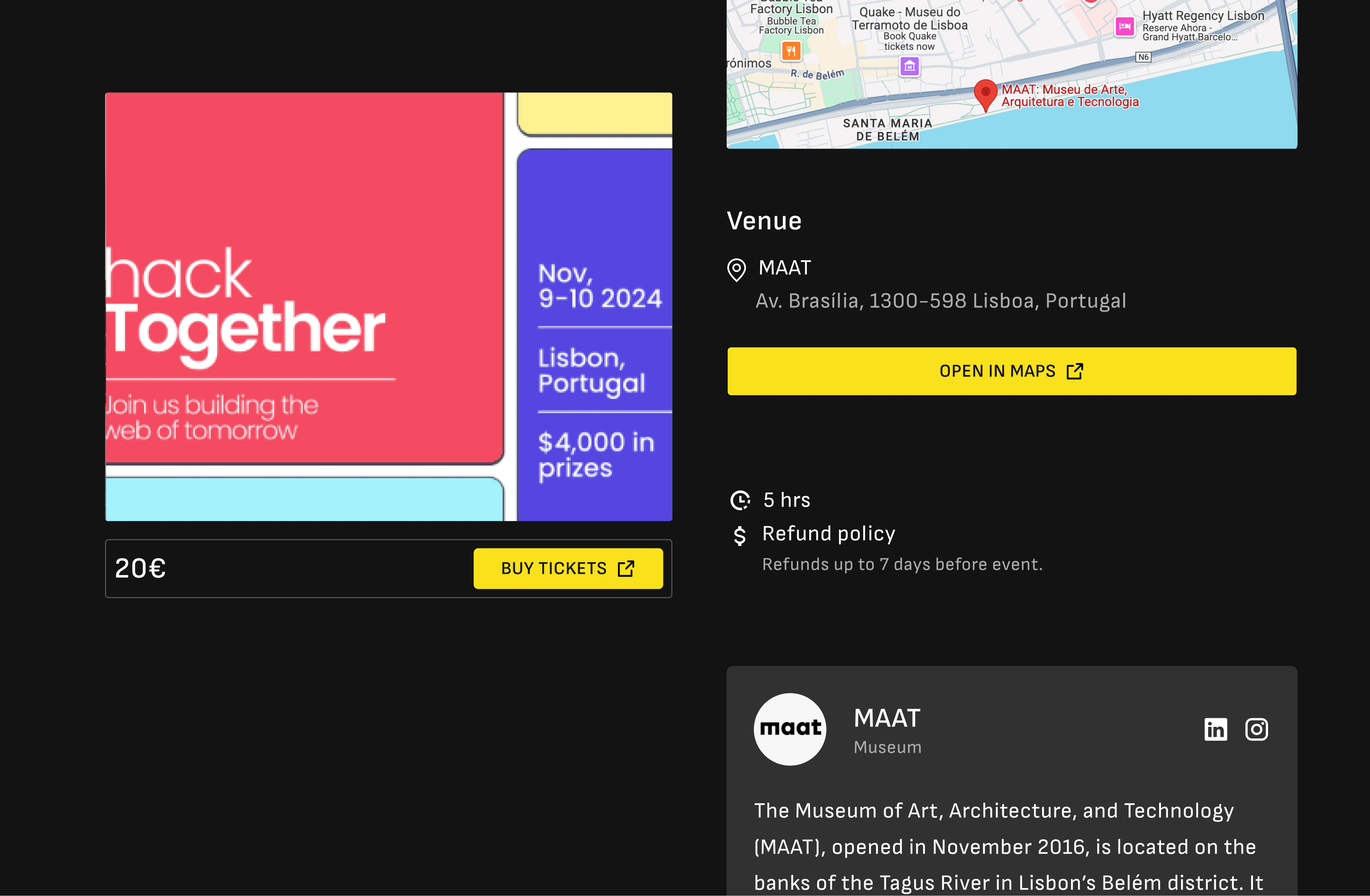
Electrico Pitch
November 9th, Lisbon
Lorem ipsum
Lorem ipsum
Register Now

18€
Tech Webinar
Aveiro, Portugal
17th, November 2024, 20:30
18€
Hack Together
Lagos, Portugal
10, November 2024, 16:00
PORTO
Tech run
Start up weekend
Electrico pitch
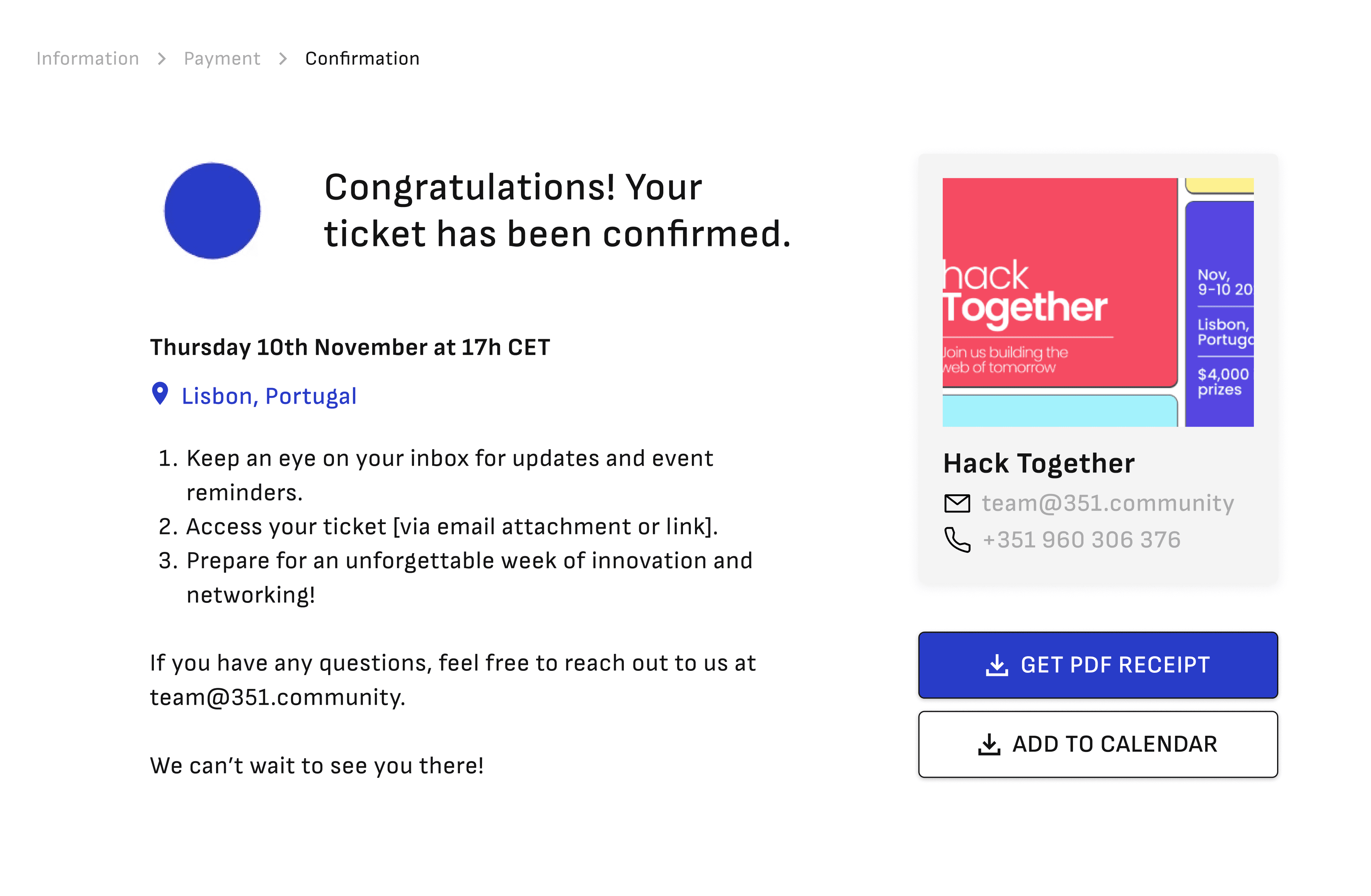
CONFIRM PAYMENT
Register Now
Open in maps
Lorem ipsum
THE BRAND
This visual language extends to the website, which adopts a minimalist black-and-white aesthetic accented with yellow and blue, alongside bold typography, immersive imagery, and azulejo-inspired patterns.
Together, these elements create a distinctive, memorable, and flexible brand identity across all touchpoints.
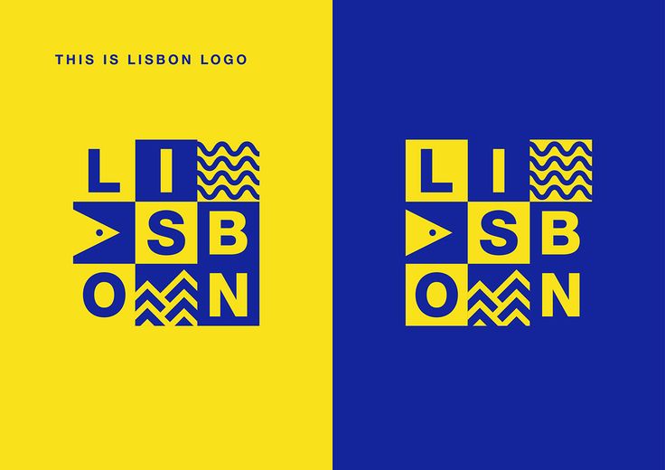
[before]
A typographic logo lacking a distinctive visual identity

[AFTER]
A memorable logo that blends Portuguese heritage with a contemporary tech identity

This visual language extends to the website, which adopts a minimalist black-and-white aesthetic accented with yellow and blue, alongside bold typography, immersive imagery, and azulejo-inspired patterns.
Together, these elements create a distinctive, memorable, and flexible brand identity across all touchpoints.
OPTIMIZED USER FLOW
[The site navigation was redesigned around several distinct user journeys]
[1]
Official initiatives organized by 351 Portugal, categorized by city.
[2]
External community events highlighted on the platform, to which users can contribute.
[3]
Dedicated journeys for sponsors and volunteers.
[4]
An informational section presenting the event and its organizers.
[5]
A user account area gathering personal information and purchased tickets.
We prioritized the most critical flow for business: booking tickets.
By clearly separating official and community events and simplifying navigation, the new structure reduced confusion and created a smoother path from event discovery to registration.
COMMUNITY EVENTS
CREATE AN EVENT
event page
HOMEPAGE
TICKETING
Main stage
CITY
porto
LISBON
BEJA
startup weekend
tech run
PTW HOUSE
ELECTRICO PITCH
SOLUTION


[FATIMA ZAHRA EL YAMANI]
GET IN TOUCH
[COPYRIGHT @ FATIMA ZAHRA E. 2026]